

Engenia Software
Engenia Unity 4.X Plug-in Tools for Microsoft Products
The Engenia Unity suite of tools includes two plug-in products for Microsoft Visio and Microsoft Project. The Visio plug-in allows users to define Engenia processes, complete with metadata, dependencies, assignments, triggers, documents, and more. This process becomes a template for the projects that the plug-in tool for MS Project can help you manage.
One of the most difficult aspects of my job involves designing user interfaces that are developed by out-sourced development firms half the world away. My designs are not faithfully implemented and when the feature is finally delivered to us, our ambitious schedule and featurelist for each product means that I have to make the decision that having the features work as specified is more important than hving them add whitespace back in, pay attention to alignment and color, remove icons they chose to add, and generally do things right. Instead, I make them actually use the text I specify, with correct grammar and American spelling, use the right data labels, and correct broken or wrong functional flow.
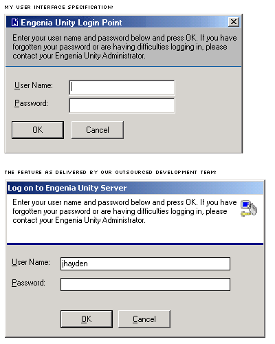
In the fall of 2003, I instructed our outsourced team to rebuild the entire user interface of the Project plug-in with a new more modern style that would borrow some visual cues from both XP and OSX, but would also put a distinctive visual stamp on the Engenia Unity functions to help our userbase instinctively understand when they were using the special Engenia Unity functions. I sent the set of images, documentation, and guidance off, and waited for the result. This example above is fairly typical of the resulting item: the elements I specified are there, but jumbled up and awkwardly placed (this is a fairly benign example of my specification versus their implementation. This screenshot dates from the time after I had them fix the errant punctuation, misspellings, and grammar by suggesting that they cut and paste the text from the documentation. When I reopened the bug marked fixed, I cut and paste the text.
The following screen examples reflect my design. These features were all implemented, but the user interfaces are clunky, awkward, and unattractive. The features now work and are in the 4.1 and 4.2 code.
Microsoft Project plug-in Redesign
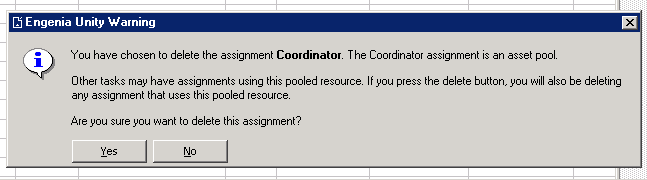
A key part of the redesign effort was to increase the amount of guidance and context-setting we were doing in the product. Our warnings became more verbose and descriptive of the impact of a user change:
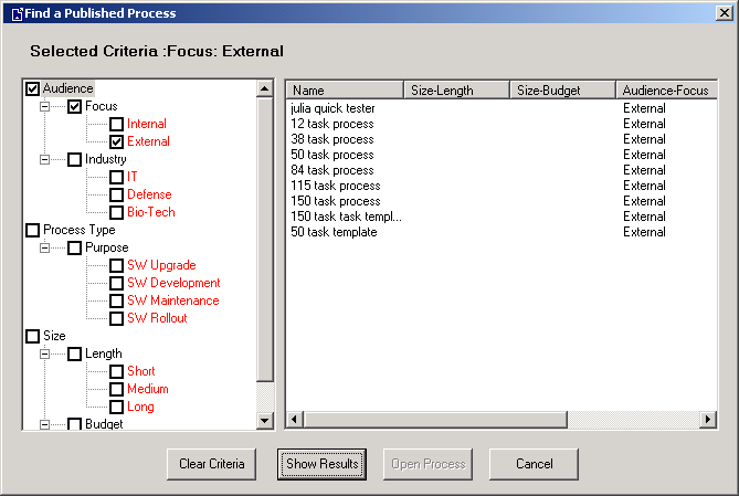
When a user creates a new project, they use a process template (usually built in Visio) to define the structure of the project. The Find functionality before Engenia Unity 4.1 had been implemented to look like this:
These did not nearly match the user interface I specified, but the constraints of time made it the user interface we had to go with. For the revision, below, I re-specified some of the same UI elements (e.g., button placement and alignment, display of criteria) as I had the for the previous incarnation, include contextual guidance text, and the visual branding to emphasize that this was a feature of our plug-in.
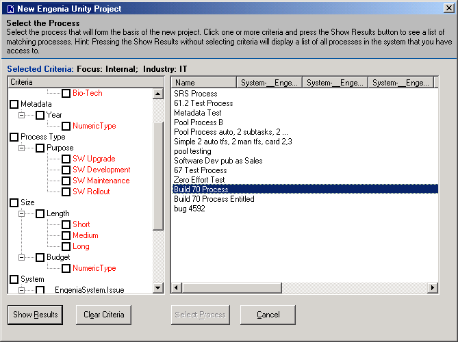
I deliberately did not specify a cleaner, more attractive tree mechanism for handling metadata (either in the filter mechanism on the left or the display columns on the right, preferring to save that for the next iteration of the feature. Our goal with this release was to get a clean, more professional-looking user interface on the product first, one that would improve product usability and help the user be more efficient and successful.
In order to achieve that goal of a more professional and usable user interface, some functionality had to be adjusted. The following screen, where users could make manual assignments at the time of project creation, was one such screen:
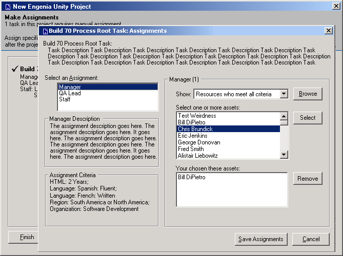
We needed to provide a more complete understanding of each assignment a project creator might make, so we would now display the assignment description and the assignment criteria. We also built in a toggle to allow a user to set some or all of the assignments for a specific task at once. Finally, we built in a filter that would allow the project creator to find those users who met the criteria.
This screen is actually a pared down version of the screen my bosses originally wanted. As highly technical people who wanted to have lots of information and options available to them at all times, the influence they exerted on the product was pretty intense. Most of the features in the system have been modified or changed halfway or three quarters of the way through a development cycle - additional fields and capabilities needed to be shoved into the user interface and database at the last minute to satisfy some itch.