

Ernst and Young, LLP
Connected[Health].net (1996-7)
My third project at Ernst and Young was also my first project as a designer with them. ConnectedX.net (of which ConnectedHealth.net was to be the first release), was an internal initiative to create reconfigurable, industry-specific software that would provide members of an industry (via their companies) to communicate and collaborate, use the power of eCommerce to do their jobs, and to get and convey key knowledge. The Center for Technology Enablement, a highly-successful boutique-like consultancy within the larger E&Y Consultancy, was responsible for the development; a new spin-off organization of our health care practice was to be responsible for the product: they were our clients.
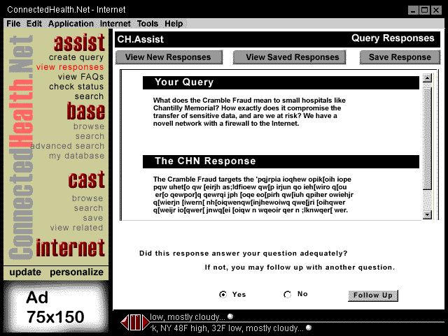
It was an ambitious project that sought to provide 4 key features: Assist (access to experts and FAQs, both corporate and national), Base (one interface to corporate, industry, natual, private, and free databases), Cast (news and information pushed to the desktop), Mart (buy, sell, bid, and trade material, services, and goods), plus access to the internet. It was built in html and java, and our clients were responsible for directing the feature-set and design.
Version 1.1 was the only release we completed. The project was shut down after 9 months, due in part to the difficulty of selling cutting-edge software to a industry rife with tight budgets and old computers.
The following screenshot (a rough specification shot for our java developers as to various screen dimensions, and never intended for release or to be representative of the product) is the only screenshot of 1.1 I have -- and it is unfortunate in that it emphasizes the ugly brown-yellow selected by our clients as a background color and plays down the jewel-colors of the assist, base, cast, and internet buttons, as well as the screened-out brand across the back of that bar. The impact in full-color was better. The bevels on the functional buttons (assist, base, cast) are very much of their time.
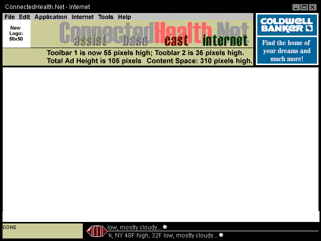
My team lead and I came up with the overall structure and organization of the application, but I did the mockups and screen designs (with valuable guidance and input from her, and guidance from our clients). The branded bar contains top-level functionality, as well as a spinning swoosh-globe logo designed by another designer in our practice. Immediately beneath that bar was a second bar that had specific navigation for each feature (for example, the internet button - which led to a built-in browser - provided typical web browser features like back, forward, home, a url bar, and the like). We built in space for advertising and a news ticker at the bottom of the page (very important features for our clients), and tried to do what we could with the relatively small space for content.
When the project shut down, we had come up with some exciting ideas to take advantage of the opportunities building into the IE 4.x browser and active desktop would afford us. These are some of the roughs that we were just soliciting feedback upon to facilitate the requirements process for future versions when the project was shut down:
In order to facilitate discsussion in terms of feature, architecture, and the organization of the information, we stuck with the same branding elements and palette of 1.1; our intention was to improve those visual elements once we identified functional and feature paths.
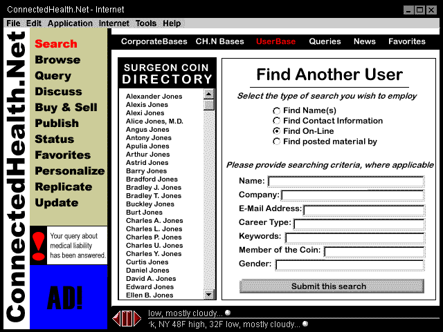
We felt that the COIN (corporate information network; a speciality intranet that could exist at a corporate or divisional level, or within specialized associations, groups, or interests) concept had been under utilized in the first version of the software, and we wanted to build channels and directories around that concept.
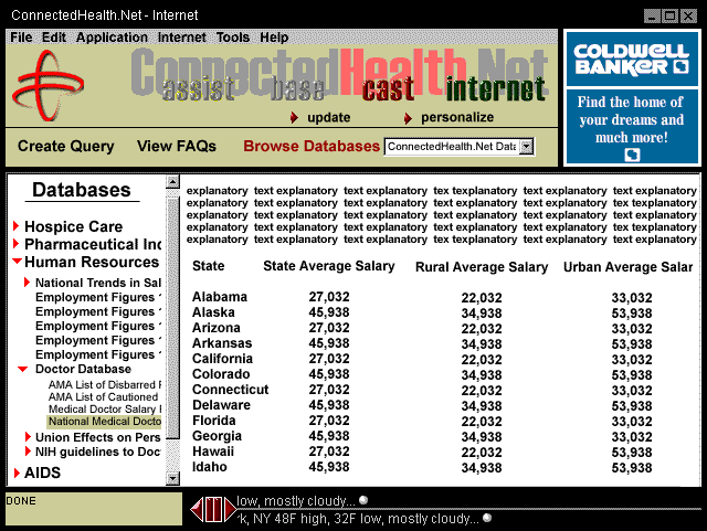
The base concept was one of the most attractive concepts of the product, but it hadn't been well-explored. This idea was intended to start that exploration: when the project shut down, we were discussing cross-database searching and aggregation.
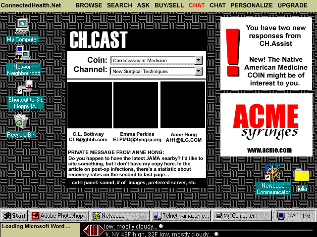
This example is one of my favorites. I thought that our product had to be embedded into the active desktop (which was a brand new concept that time) to really meet the goals of our clients. In this model, key information is passed to the desktop while the user collaborates in the foreground.
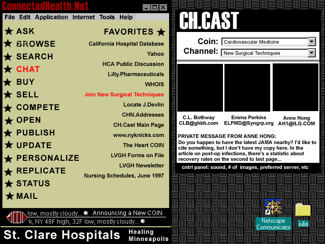
The idea of navigational window came up often as we were discussing the potential future paths of the product. Users would access a navigational window (made purposely plain here to focus user attention on the content and not the design) by double-clicking on the St. Clare's box which would always be lodged on the desktop.
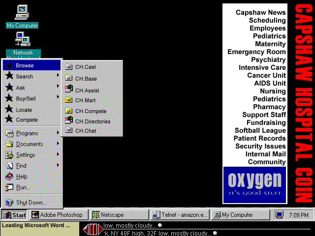
This final example, which displays both a docked coin and the functionality embedded in the desktop was one of the most popular concepts we posted. The links from the coin would take you to subject-specific aggregated sites (clicking on Psychiatry might offer up recent news, schedules, access to specific databases, and an employee database); the links from the start menu would take you to feature-specific hubs where you could start new discussions, search all databases, or post a new message to be broadcast out.