Other Projects
Personal Website (julen.net)
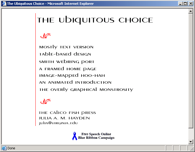
I built my first website in 1994. It featured a stylized flower and a list of links. As web browsers matured, so did my style, abilities, and critical eye. In 1996, I designed "The Ubiquitous Webpage" below which mocked the then-common practice of having 4 different versions of your webpage available for consumption. I filtered the contents of my personal web-page through each of these styles (thereby mocking myself in the bargain):
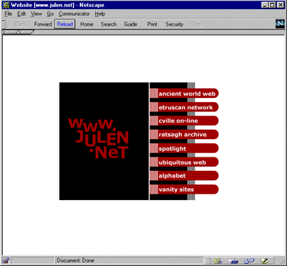
That design worked while content was relatively static; as I added content to the site, I found it burdonsome to update it in 3-4 places. The next design iteration coincided with my acquisition of this domain name. I reorganized all content on the site, categorized it, and kept a relatively stark color scheme.
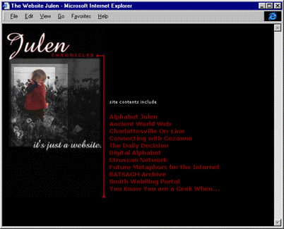
The next version of the site required a substantive change in the information architecture. I cross-referenced everything alphabetically, and created a new visual organization around that alphabetical index. The concept of an alphabet as organizing mechanism for a person's (on-line) life struck a chord: I had my first two imitators within 45 days.
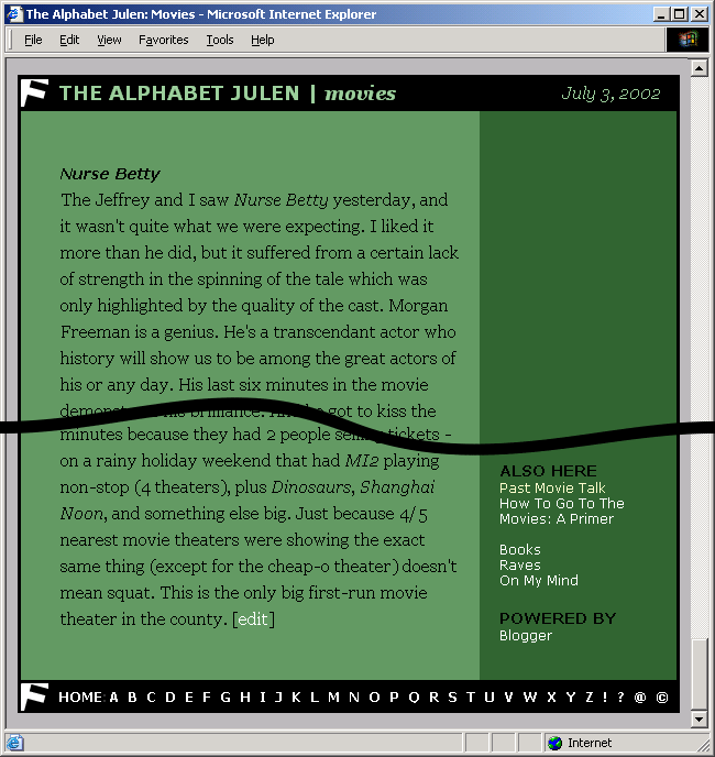
Over time, I began to chafe at the limitations on content space I had allowed myself, and did a complete facelift on the site and content. I also shifted away from the stark book arts-inspired color scheme and went through a series of jewel tones - blues, purples, and finally greens. I also chose to emphasize the letters of the alphabet in the visual layout.
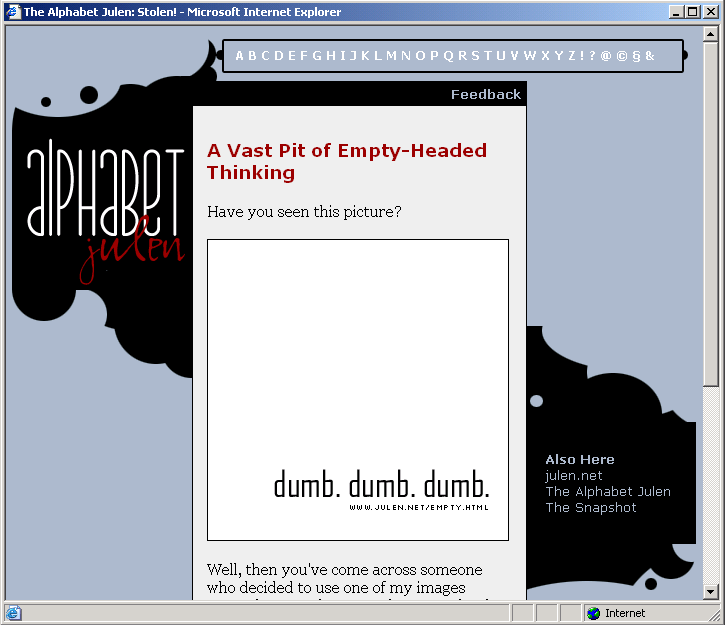
When I decided to redesign the site in standards-compliant HTML and CSS (as opposed to the hybrid approaches in earlier designs) and remove all of the HTML hacks, I went for a completely different look. I brought back some of the book arts colors (black, red, white, grey), which I think are visually striking, and paired it with a color that is something of an inside joke: the hex value for the light blue color is #AABBCC. Another hidden features of this design feature the index letter for the page that appears when the user mouses over the black area beneath the Alphabet Julen brand.
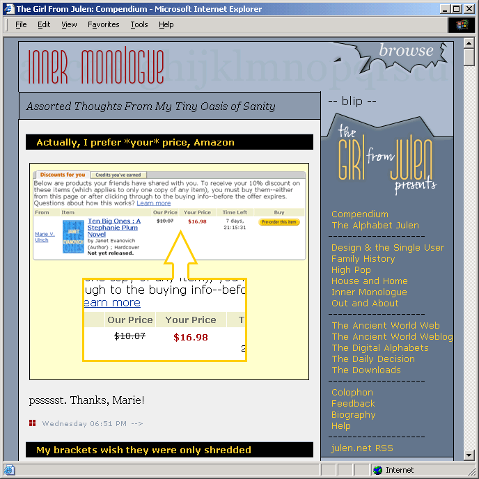
The most recent redesign, below, preserves the color palette (with the addition of a bright yellow, and variants of the #AABBCC blue), but changes the entire tone of the interface. Although the alphabet navigation still exists, I've downplayed it in the user interface. Although I really like the obscurity of navigating the website with the alphabet motif, key members of my core audience (including my grandmother and mother) prefer this model.