

Title:
Julen.Net Website Design v.6
Type of Project:
Personal Site
Design Discussion:
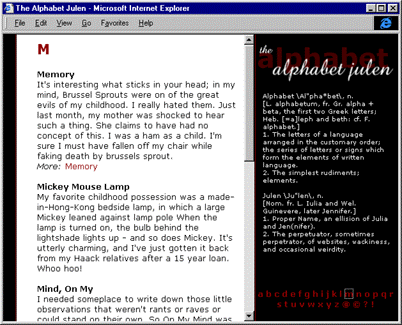
The underlying metaphor of version 6 (and of the current version of the
website) is an alphabet book.
The colors were carried over from the previous design, but the navigation was radically changed.
By making the alphabet metaphor the primary navigational mechanism, I require the site visitor to make a greater investment to reach the meat of my website, where I apportion out information sparingly.
Rejection Rationale:
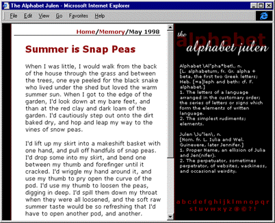
The usage of frames made it difficult for many of my frequent vistors
to bookmark specific pages.
Individual content page design was balanced by the navigational pane of the frameset; in its absense, the individual content pages could appear plain and unbalanced.
Because of the frame issue, the navigational schema had to appear on every page, which was not an optimal design feature.
I was unwilling to build javascript to force-load frames because many of the aforementioned frequent users had browsers that could not handle javascript for a variety of reasons.
Finally, the colors used had been hallmarks of the website for nearly two years, and I felt as if I was geting in a rut.
I required new colors and a different attitude than this sober, book-inspired look.