
Title:
Company Directory
Type of Project:
Design Challenge
(Challenge Outline: 2 entirely different designs for an intranet staff
directory)
Project Purpose:
Outside the challenge description (intranet staff directory), no design
or functional parameters were presented, so the two options would serve
very different communities and needs.
Design Discussion:
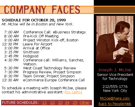
The first design is a very tool-oriented design. The user is expected
to use the directory to obtain timely and up-to-date information. It's
highly ordered design combines a utilitarian feel with a bold combination
of colors.
The second design is more like a page from the rolodex, but with the unique advantages of the web built in. The deliberate pixellation of the image behind it and the almost-jarring contrast color is suitable for a page that is likely to be viewed once in a rare while.
Rejection Rationale:
It was a design challenge, and never destined to be implemented.
The challenger did say that they preferred the hipness of the second design, but the utility of the first.