1.
2.
3.
4. [Selected Design - For Comparison's Sake]

Title:
Quartz BBS Logo
Type of Project:
Identity Project
Design Discussion:
Quartz II BBS is an internet-accessible BBS where discussion ranges from
the scholarly to the silly. In any one week, people will be talking about
politics, baseball statistics, hair dye, muppets, books, movies, ethics,
the law, food, and pop culture.
I got absolutely no direction. I relied on my years of participation in the community, and developed a dozen options for the BBS to view and vote on. The overwhelming winner was a strongly linear design that focused on the Quartz domain as a whole. That winner is reproduced below.
The three other finalists appear to the left.
Rejection Rationale:
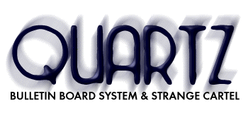
Finalist #1 was described as being "dizzy" or "smeared."
It didn't "feel precise" (precision is a definite characteristic
of the BBS) or "clear." The people who mentioned the tagline
liked it, even if they found it oblique ("But, of course, 'oblique'
can describe the BBS, too").
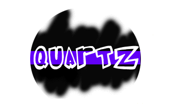
Finalist #2 received more acclaim. People liked the causal text and the untamed "squiggliness" of the black. They felt it represented the off-beat nature of BBS participants, and highlighted "night-flightiness" that some participants indulge in.
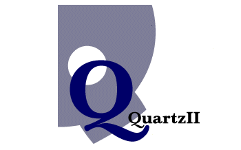
Finalist #3 was condemned as being "too elegant for this BBS" by some, and "too stark" by others. One person even called it "bland."
The winner (#4) received near universal acclaim. The users felt that it combined the best aspects of the other finalists, with an additional sense of verve that others were lacking.