Title:
Something Industries*
Type of Project:
Corporate Site
Project Purpose:
To redesign the front page of a corporate website.
Design Discussion:
The corporation was to relaunch a public relations campaign around the
new charismatic CEO and a strong emphasis on tradition, quality and trust.
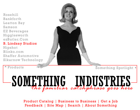
The female figure here replaces the portrait of the CEO who had his arms raised in the air; a familiar catchphrase from the company's past was resurrected for the publicity campaign.
Originally the product icons were grouped around the figure, with the four anchoring logos would rise from the red box, but that proved to be politically unsuitable.
The bottom two rows of links absolutely had to be there, in that format. The client was most insistant.
Rejection Rationale:
When the CEO left the company, this design simply wasn't appropriate any
more.
*Company name, products, and subsidiaries have been significantly changed.